7 Best Color Theory Charts for Beginners to Use
Master color theory! Discover 7 essential charts perfect for beginners. Elevate your designs today.
Staring at a blank wall or a pile of fabric swatches can feel overwhelming when trying to coordinate a home. Color theory isn’t just for professional designers; it is a practical tool that helps anyone make cohesive, confident choices for their living space. Selecting the right color wheel can save time, money, and the frustration of mismatched home accents.
Creative Color Wheel: The Dependable, All-Around Tool
Whether freshening up a living room or choosing new throw pillows, the Creative Color Wheel remains the industry standard for a reason. It provides a straightforward, rotating interface that clearly illustrates color relationships like complements and triads.
This tool is ideal for homeowners who prefer a tactile approach to planning. Because it is made of durable cardstock, it fits easily into a junk drawer or a craft bin without taking up precious space.
The bottom line: if you need a reliable, no-frills reference that stays accurate regardless of how often it is used, this is the most practical choice.
Pocket Color Wheel: Perfect for the Paint Store Trip
Shopping for paint chips at a busy hardware store often involves harsh fluorescent lighting that makes colors look different than they will at home. A pocket-sized wheel fits discreetly into a purse or pocket, allowing for immediate color matching against potential paint swatches.
These models are usually smaller and focused on portability rather than complex color mixing. They work well for those living in apartments who frequently move furniture or update accessories and need quick guidance on the go.
The bottom line: prioritize this model if shopping for paint or textiles is a regular occurrence and portability matters more than desk-bound reference features.
Mudder 3-Piece Set: Best Value for Multiple Projects
Large homes often require planning in multiple rooms simultaneously, from the kitchen to the master bedroom. A multi-piece set allows for keeping one wheel in the garage workshop and another in the home office for easy reference.
These sets typically come at a lower price point, making them an economical choice for families working on DIY projects on a budget. While the material quality may be thinner than professional-grade artist tools, they are perfectly functional for everyday decorating.
The bottom line: this set offers the best cost-per-unit value for households that tackle projects in different zones of the house at the same time.
Gray Scale & Value Finder: For Matching Light & Dark
Many decorators focus entirely on color while ignoring the importance of value, which is the lightness or darkness of a hue. A Gray Scale & Value Finder helps ensure that furniture and rugs don’t just match in color, but also provide the right amount of contrast in a room.
This is a critical tool for those struggling with “flat” looking rooms where everything seems to blend together. By checking the gray scale, it becomes easy to see if a room needs a darker anchor piece or a lighter accent to create visual depth.
The bottom line: use this when you suspect a room looks dull or uninspired, as it solves the problem of missing contrast that color alone cannot fix.
U.S. Art Supply Wheel: Best for Mixing Custom Colors
For those who enjoy painting furniture or creating custom wall art, the U.S. Art Supply wheel offers more detailed instructions on color mixing. It includes information on primary, secondary, and tertiary colors that helps in understanding how specific shades are created.
This wheel is slightly more robust than standard paper options, which is helpful if it will be kept near paint supplies where spills could occur. It serves as an educational tool for anyone interested in learning the science behind why certain colors work well together.
The bottom line: pick this option if your DIY projects involve mixing your own stains or paints rather than just selecting pre-mixed options.
Laminated Poster Wheel: Great for a Craft Room Wall
A wall-mounted, laminated color wheel is an excellent choice for a dedicated craft room or home studio. Because it is large and protected by laminate, it can withstand the occasional splash of water or paint without losing its clarity.
Having a large, visible chart makes color selection a seamless part of the creative process. It eliminates the need to dig through drawers when you need a quick reference while standing at a workbench.
The bottom line: invest in this if you have a permanent creative space and want a high-visibility, durable reference that won’t get lost in the shuffle.
The Color Cube: An Easy Way to Match Existing Decor
The Color Cube takes the mystery out of color schemes by providing pre-selected, ready-made palettes. It is less about teaching the theory and more about giving concrete combinations that are guaranteed to look good together.
This tool is ideal for homeowners who find the technical aspects of color wheels too complex. It functions more like a deck of cards, where you can pull out a combination and test it against your existing sofa or hardwood floors immediately.
The bottom line: if you want professional-looking results without studying the theory, this is the most user-friendly approach.
How to Read a Color Wheel for Decorating Projects
Understanding the basic structure of a color wheel allows for more informed decorating decisions. The circle is divided into primary, secondary, and tertiary colors, which form the building blocks of every color scheme.
- Complementary: Colors directly opposite each other, used for high contrast and drama.
- Analogous: Colors next to each other, used for a soft, harmonious, and relaxing look.
- Triadic: Three colors equally spaced, providing a balanced but vibrant palette.
Most wheels have a built-in window that rotates to highlight these relationships automatically. Always test these combinations in the actual room to see how your specific lighting affects the outcome.
Hue, Tint, & Tone: Simple Terms for Picking Colors
These three terms define the variations of every color and are essential for keeping a room from feeling chaotic. A “hue” is the pure color, a “tint” is that color mixed with white, and a “tone” is the color mixed with gray.
Using only pure hues can often feel overwhelming, which is why interior designers rely heavily on tints and tones. When selecting decor, try to keep the “temperature” consistent by mixing various tints and tones of the same hue family.
This approach creates a cohesive, high-end look without needing to buy all new furniture. Start by identifying the dominant hue in a room, then use the wheel to find lighter tints and muted tones that coordinate with it.
The 60-30-10 Rule: A Guide to a Balanced Room
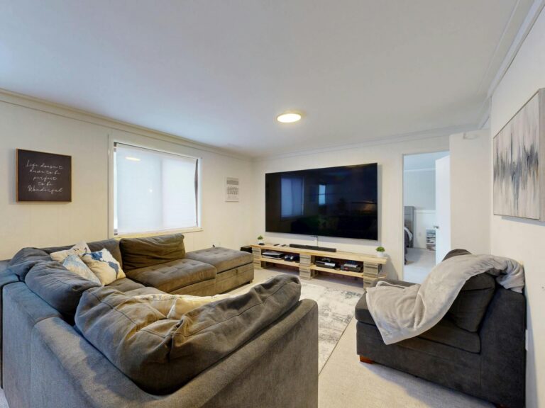
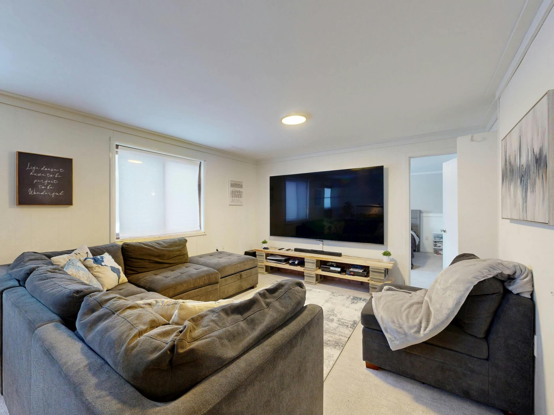
The 60-30-10 rule is a foolproof framework for applying the colors you have chosen. Assign 60% of the room to a dominant color, 30% to a secondary color, and 10% to an accent color.
- 60% (Walls, rugs, or large furniture): Provides the base for the entire room.
- 30% (Upholstery or window treatments): Adds interest without overwhelming the space.
- 10% (Pillows, artwork, or small decor): Introduces a pop of color that draws the eye.
This balance prevents a space from feeling too busy or too bland. Stick to these proportions, and your room will feel professionally designed even if it was assembled over several years.
Armed with these tools and simple rules, you can transform any room in your home with confidence. Whether you choose a simple pocket wheel or a comprehensive color cube, the best choice is the one you feel comfortable using every day. A well-coordinated home is within reach when you let color theory take the guesswork out of your decorating journey.